
01
You’d never talk about a friendthe way you talk about your photos.
On being hardest on ourselves, and what happens when you finally see what everyone else sees.

The journal / Color
Before anyone reads a word, they feel your colors. A short guide to choosing a palette that sounds like you.
By Becky Rickett, founder of VividlyHER. 2 minute read.
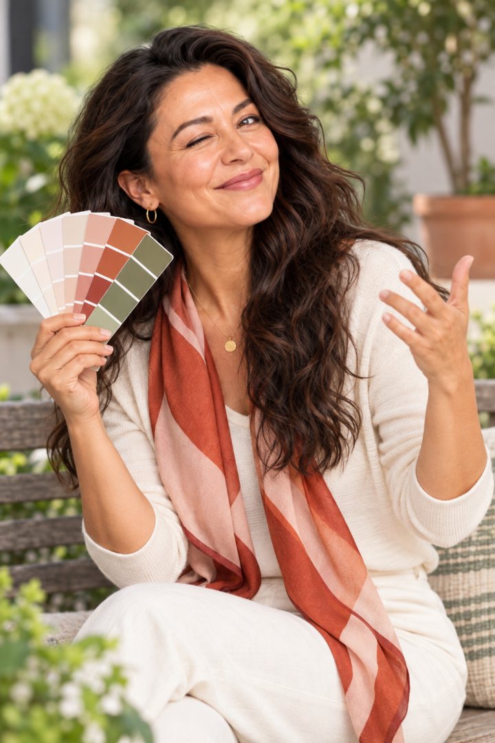
Before a visitor reads a single word on your website, she has already felt something. That’s your color, walking into the room ahead of you.
Deep plum feels grounded and a little luxurious. Bright coral feels warm and outgoing. Navy says steady. Sage says calm. Black and gold say “I charge accordingly,” which, for some of you, is exactly the message.
None of these is right or wrong. The only wrong palette is one that says something you don’t mean.
Most women pick website colors the way they’d pick a sweater. “I like teal.” That’s a fine start, but a website isn’t a sweater. It’s how your clients will feel when they meet your business.
So start here instead. Finish this sentence: after spending time with me, clients feel ______.
Safe. Energized. Taken care of. Understood. Ready. Whatever your word is, that’s the feeling your colors should carry.
Choose the color that feels like your best day.
A good website palette is usually five colors with five different jobs:
The trick is restraint. Your boldest color should appear in small, important places. Paint the whole page coral and nobody can find the button.
Pale gray text on a white background is not elegant. It’s unreadable, especially for anyone who holds her phone at arm’s length to read a menu. Choose text that’s truly dark.
Neon anything is a young woman’s game, and even she regrets it.
And if your colors came from a logo someone made in 2008, you’re allowed to update them. Loyalty to a hex code is not a virtue.
We built a color wheel so you can explore this without reading a design textbook. Start with a feeling, move around the wheel, and see a full palette with what each color is for.
When you build with VividlyHER, your colors come out of the same conversation as your words, so they belong together. Your color walks in first. Make sure it’s saying hello the way you would.
Try it right here
Drag the dot around the circle. The little website and its palette change with you.
Your turn
No perfect photo needed. Messy hair welcome. Your camera only turns on when you tap.
Keep reading
On being hardest on ourselves, and what happens when you finally see what everyone else sees.

A kind but firm intervention for the headshot that has outlived two phones, three haircuts and a pandemic.
On underselling, the word “just,” and why your results belong on the page in plain sight.