Before you choose a color for your website, think about the person arriving there. What do you want her to notice first? Your experience? Your warmth? Your willingness to see things differently?
Write down three words you want your presence to carry. Grounded, expressive, welcoming. Clear, thoughtful, bold. These words give you something to return to when a beautiful color doesn’t quite feel like yours.
A palette is a relationship between colors, photographs, type, and space. Your favorite color can be a wonderful starting point. It doesn’t have to fill the whole page.
Give every color a purpose.
Start with a canvas, a signature color, a companion, and a readable text color. A quiet canvas leaves room for the story. A signature color can draw attention to an invitation. A companion adds warmth or contrast in smaller areas. Your text color does the everyday work of helping someone read.
Try keeping the words and layout the same while changing the palette below. You can feel the difference without redesigning everything at once.
A LITTLE DISCOVERY, IN REAL TIME
Meet your color story.
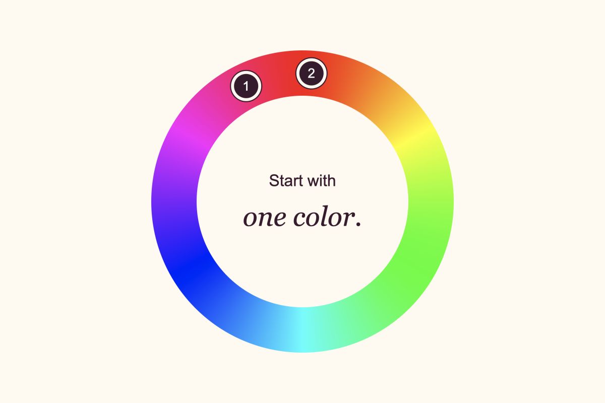
Choose a color you’re drawn to. See what happens when you give it company.
Love it? Bring it with you when you build your website. Keep up to four favorite palettes to try. You choose which ones to save.
Start with one color.
12
Nearby hues share a family resemblance. Notice how gently they sit together.
YOUR NEXT CHAPTER Made visible.
YOUR EXPERIENCE. YOUR PERSPECTIVE.
A presence that feels like you.
Your words have a place here. Color helps set the scene, while your story gives it meaning.
Let’s begin ↗Example button · live color preview
Thoughtful details. A feeling all your own.
Try as many colors as you like. Your website changes only when you apply. In the studio, choose Save my colors to keep a favorite. Your words and photos stay with you.
What the color wheel can show you.
Neighboring hues can create a connected feeling. Opposite hues can introduce more contrast. One hue in several depths can feel considered and cohesive. These are starting relationships, not rules about who you are or what your profession should look like.
Color associations depend on context, culture, and personal experience. Blue doesn’t guarantee trust, and pink doesn’t tell someone what kind of woman you are. Ask what the whole page communicates, then make room for your own response.
Beautiful needs to be readable.
Hue contrast and reading contrast are different things. Two colors can sit opposite each other on a wheel and still be difficult to read together. Light and dark matter, too.
Your colors should make your words easy to read. The color wheel helps you explore combinations that keep your text clear. Try your favorites, then see how they feel on your phone and laptop.
Make the palette yours.
Look at your colors beside your own photograph. Check a headline, a paragraph, and a button on your phone as well as your laptop. If everything asks for attention, let one element lead. If nothing stands out, give your invitation a stronger contrast.
You don’t need to decide forever. Choose a direction you want to spend time with, bring it into the studio, and let your words and images help you refine it.